[appeared originally on U.K.-Based Printworks magazine’s website, 1998]

“For Miles”, AP lll, 1993, Epson archival Ink-Jet print
Confession
I must confess, I have never touched an engraving plate, or pulled a screen print. According to accepted definitions, I am not a printmaker at all. I do not use stones, blocks, or plates, acids, washes, or inks. I do not get cut, or dirty, breath harmful fumes, or need upper body strength. I work alone, with near complete control of my image from start to finish.
Yet I make prints: Iris prints, laser prints, and ink-jet prints, limited edition prints on fine archival papers. I have exhibited them, just as I have exhibited my sculptural work. Whether my Prints are good, mediocre, or unacceptable, depends not only on aesthetic judgment, but also on the operative definition of original fine art print.
From the Barricades to the Salon
From time to time, the upstarts shake up the academy. From my side of the Atlantic, the R.E. after many of the names associated with Printworks looks a bit stuffy – a Royalist holdover from previous times. Actually the R.E. stands for Royal Engraver, a proud hundred-year old moniker that memorializes a successful past struggle against critical hostility.
Lounge crooners the world over sing Mack the Knife, obscuring The Three Penny Opera’s avant-garde origins. The ghosts of Kurt Weil, Scott Joplin, and Duke Ellington rub shoulders in the establishment. The output of the revolutionaries eventually becomes the status quo.
A century ago, it would have seemed aesthetically laughable and financially idiotic to collect a large commercial screen print by Henri de Toulouse-Lautrec. Today it is more than a safe bet, like collecting Impressionist art. All screen-printing was once excluded from the fine art print family. Today, a lingering Inferiority Complex survives; many still prefer the more ‘high falutin’ term ‘lithograph’ over ‘screen print.’
The Digital Printmaker
 Artists have been making digital prints for years now. I started experimenting in 1984 with my 512K Mac and a black ink daisy wheel printer (Remember those?). The tools were so primitive that I felt like I was making potato prints with my ‘wrong hand.’
In the early 1990’s came the sophisticated painting/drawing programs along with powerful computer processing chips and memory storage capabilities needed to run the new applications. These programs are enough to make many an artist salivate.
The capabilities include a reputed 2.4 million colors, layering, multiple masking, perfect registration, truer colors, unlimited collaging of images, resizing, expanded tinting, and the ability to save earlier versions of a work. While some of these capabilities mimic those in hands-on printing, others far surpass them. True, I have lost work to glitches, suffered a frozen digitizing pen, been unhappy with output colors, and frustrated by output size restrictions. But it is the advantages of digital over hands-on printing that attracts me to the medium.
Why Make Digital Prints
 What artist has not been well along a significant road only to make the wrong turn and ruin a work? How wonderful to return to the fork in the road, where the errant turn was made, but this time choose the right path. When I ruin an exciting ‘painting,’ I have the option of returning to an earlier saved version, and starting back from there. In my Print Triad, I tried more than twenty different ways to fill, overprint, and blend a masked bubble-shaped area, until I got it right.
Why not enjoy the freedom of unlimited color mixing without the mess, risk, cost, and time consumption of multiple pass screen-printing? I doubt I can see 2.4 million colors, but that is how many my Mac painting application allows me to create.
Why not save the color palette of every ‘painting’ made? Inks run out, mixtures dry up, and recipes never seem to produce quite the same color twice. I can preserve my palettes forever. By sampling any area in a ‘painting’ I can also create a palette from scratch.
‘Theoretical colors’ have advantages over printer’s inks. Imagine incredible possibilities for under painting, washes, and off-registration blending, and tinting. In my Print Recreation, I have a pink horizontal figure that overprints gray and olive areas above, and below it. These perimeter areas are clearly tinted by the pink figure. Yet they remain very visible, while the tint is still a rich saturated color everywhere else. Printer’s inks preclude this. With the Mac, I mix a very deep color (close to a black), and then tint at just seven to twelve percent. The best part is I can even work backwards, starting with the final tint result I want.
Unlimited Collaging is possible without scissors and paste. Imagine if the prolific American Artist Romare Bearden (1911-88) had lived another decade or two. He could have scanned his many black and white original photos (or downloaded his own original color or black and white digital photographs), color scraps from magazines, pieces of cloth, or other media. He could have stored these images in vast libraries, used them over and over, combined them in multiples, resized them, or tinted them.
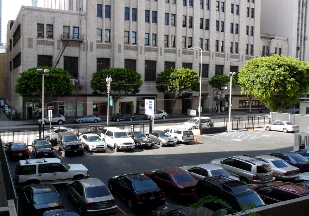
Right now I am working on a series that alters and combines digital photographs of the most commercial of squalor, Los Angeles’ Pico Boulevard. I am collaging for aesthetic or formal effect, not social commentary –fresh ways of seeing everyday visual phenomena. I like to take my own images using my digital SLR. This allows me collage sources outside the typical clipped (art directed) magazine spreads. Digital collaging allows me greater originality.
Why Must Digital Technology be a Threat?
 Digital images can be stored, replicated, and communicated indefinitely. Unlimited editions and no stone to deface or plate to destroy, offer a democratic anti-commercial alternative to traditional fine art printing. They also undermine the artist’s control over printing, papers, ownership, payment, and piracy. For these reasons, digital printmakers share, no less than the traditional print community, a pressing need to establish standards of definition, originality, technical quality, and the like.
We computer artists must not wait for traditional printmakers to come to us to establish new standards of fine art printmaking that include us. We must propose tests for inclusion and exclusion. It is not enough to require limited editions; is a scanned watercolor painting printed on an Iris printer original? What kind of art is a collage of painted pieces of photocopy? How about David Hockney’s Faxed prints? Digital print standards must answer these kinds of questions. Neither technology nor aesthetics stand still.
It is a cliche that the world turns faster and faster; fortunately or unfortunately, it is true. Maybe artists are not getting better or smarter, but art technology is. Printmakers, and indeed all creative people, need to keep up with changes in the world. Authentic artists will always get the most from any tool or media. Digital printmaking has much to offer these explorers. The wrinkles can be ironed out along the way.
All Prints were drawn on a Wacom computer drawing tablet using Pixelpaint software on a Mac cpu. Printed on Hannemühle Frankfurt digital paper using an Epson ink-jet or Canon laser printer. Printed in tabloid size; hand torn down to 13″h. x 10″w. (or similar size) to better define the edges. There was no use of a scanner, and no introduction of photography, in these works. All works shown were computer-composed / produced.
Photos, ©1998, William Nettles, Los Angeles
All artwork and text © 1998 / © 2014 by Steven Dornbusch


 Artists have been making digital prints for years now. I started experimenting in 1984 with my 512K Mac and a black ink daisy wheel printer (Remember those?). The tools were so primitive that I felt like I was making potato prints with my ‘wrong hand.’
 What artist has not been well along a significant road only to make the wrong turn and ruin a work? How wonderful to return to the fork in the road, where the errant turn was made, but this time choose the right path. When I ruin an exciting ‘painting,’ I have the option of returning to an earlier saved version, and starting back from there. In my Print Triad, I tried more than twenty different ways to fill, overprint, and blend a masked bubble-shaped area, until I got it right.
 Digital images can be stored, replicated, and communicated indefinitely. Unlimited editions and no stone to deface or plate to destroy, offer a democratic anti-commercial alternative to traditional fine art printing. They also undermine the artist’s control over printing, papers, ownership, payment, and piracy. For these reasons, digital printmakers share, no less than the traditional print community, a pressing need to establish standards of definition, originality, technical quality, and the like.